A new website for the Bank Saint Petersburg: design and development
Web
Fintech
Intro
We conducted a series of studies, provided a redesign, and developed a new version of the bank’s website.
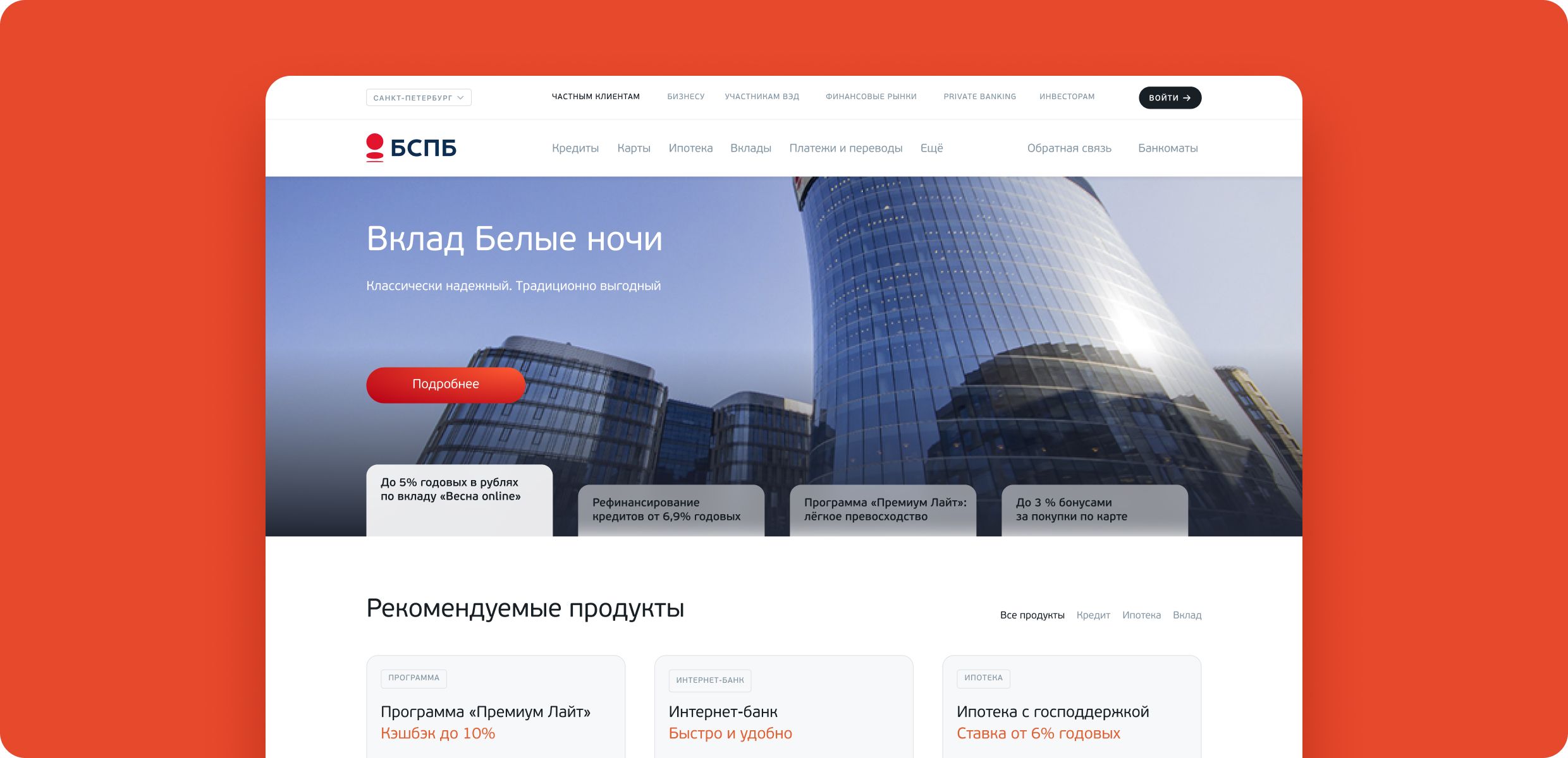
See in action the design vocabulary to optimize new products and services launch
Intro
The bank had its website before. But some features needed to be fixed: the architecture was not scalable; the mobile version required separate maintenance. So, It was decided to empower the bank’s workforce and involve the MobileUp team.
Task
It was necessary to design and develop a new version of the website in less than a year. The other task was to integrate into the team and optimize the launch of new products and services.
to update the website, work out the UX, and the request form conversions on the bank website
to reduce the time to run tests and experiments that the bank team regularly conducts
to reduce the load time of a new website
Заголовок

One of the most important tasks was to deal with two previous bank sites because we still had to support the web and mobile versions separately. It was necessary to build one service from two parts, and come to the consistency of the pages.
Solution
The Bank Saint Petersburg had spent some weeks releasing a new page before.
We offered to use a constructor model as a basis so that the bank could release new pages, experiments, and products within hours.
The current site has been refreshed and updated, based on the visual concept of the bank. Together with the bank, we decided that the first version should not be radically changed. We tended to evolution, not to revolution.
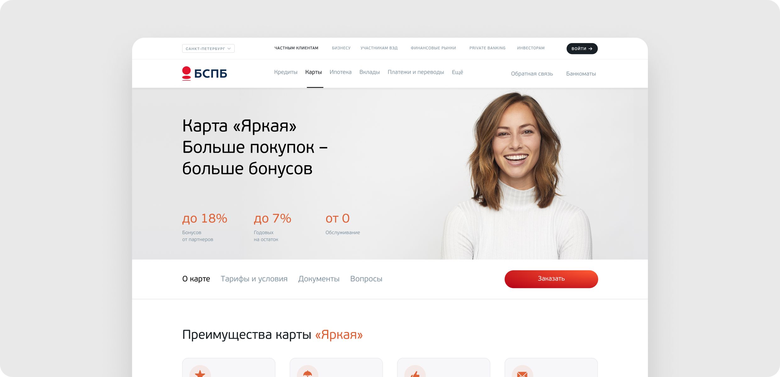
This is what the bank's website looks like now
Analytics and Ux/Ui design
500 pages in less than a year look like a lot of work from any angle.
It is essential to keep in mind that the current content will move to a new reality and be transformed into our new visual concept and stay in it.
Do you have a similar task? Let's discuss!
Research
The bank has provided such detailed research as a description of the target audience, competitor analysis, and CJM.
In addition, an analysis of the individual’s and legal entities’ behavior was carried out. We had enough artifacts — we studied information, structured it, and compared the data with the business goals of the bank. MobileUp started to design a new service based on the data.
Заголовок

We carefully transferred the logic of the loan and deposit calculator to the new interface, taking into account all possible filters and parameters that the user could apply.
Design vocabulary
We have developed a design vocabulary that still has been helping to scale the solution. It includes all the necessary elements to create pages:
component library
font styles
indentations
sizes
content guidance
image selection guidance
dependencies guidance
The library was formed iteratively: the first block of important components was done and given to the client. The guys from the bank are completing the block while we are working on a new one at the same time.
We worked closely with the design department of the bank to seamlessly integrate our solutions into the brand and the bank products. The guys from the Lipsoft design team have worked on over 200 images and banners for the project.
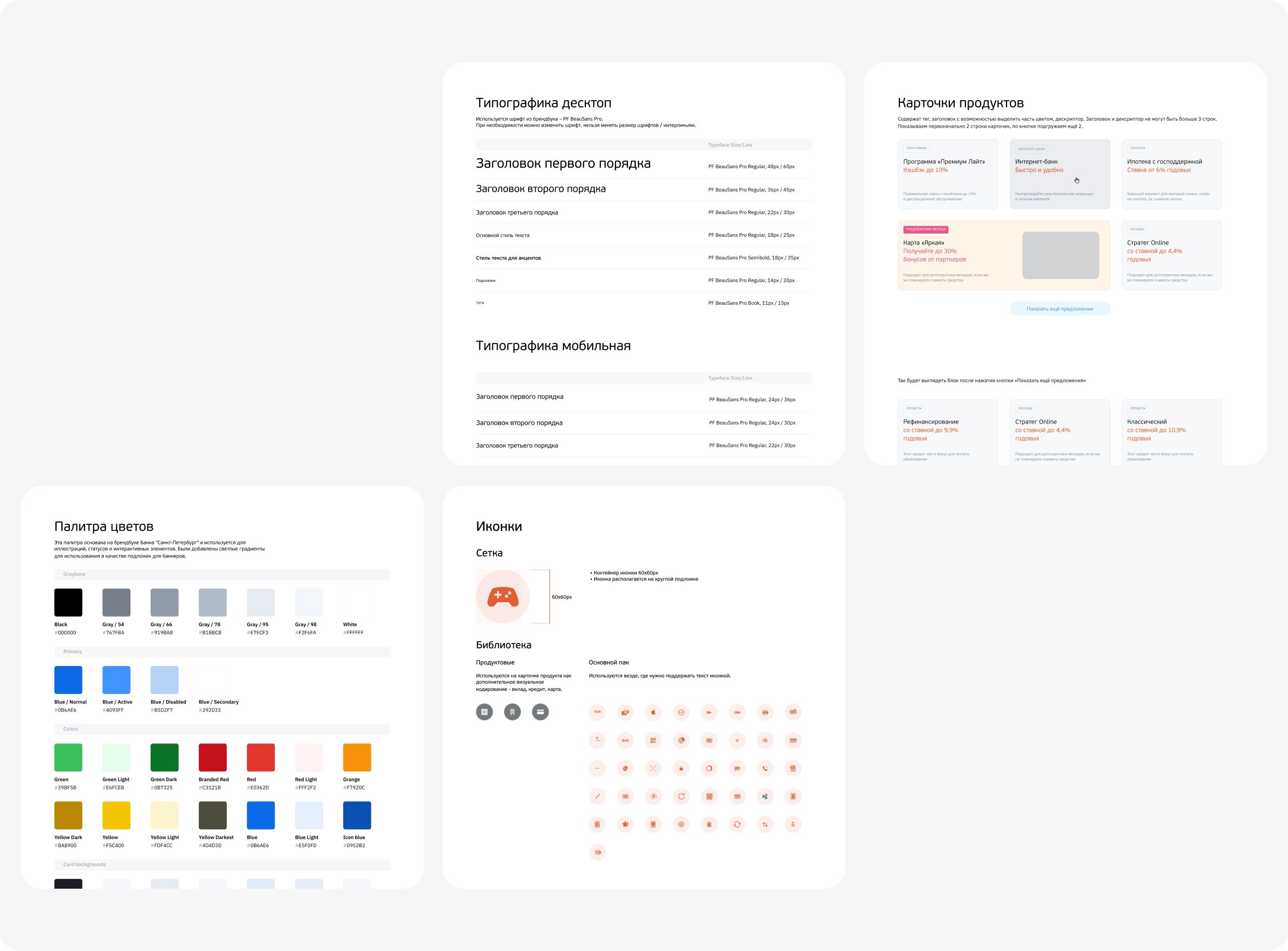
A systematic approach to framework systematization
Page templates
We thought a template through to accelerate the design process. The size of the bank’s website is large, about 500 pages.
If we deal with such page size, it is essential to think over the logic of the elements and pages in general to have a single system on the one hand, and the opportunity to show individuality and focus the user’s attention on the other hand.
We didn’t forget about the content managers who would have to create and update the information. The content is diverse, but the pages have a similar structure.
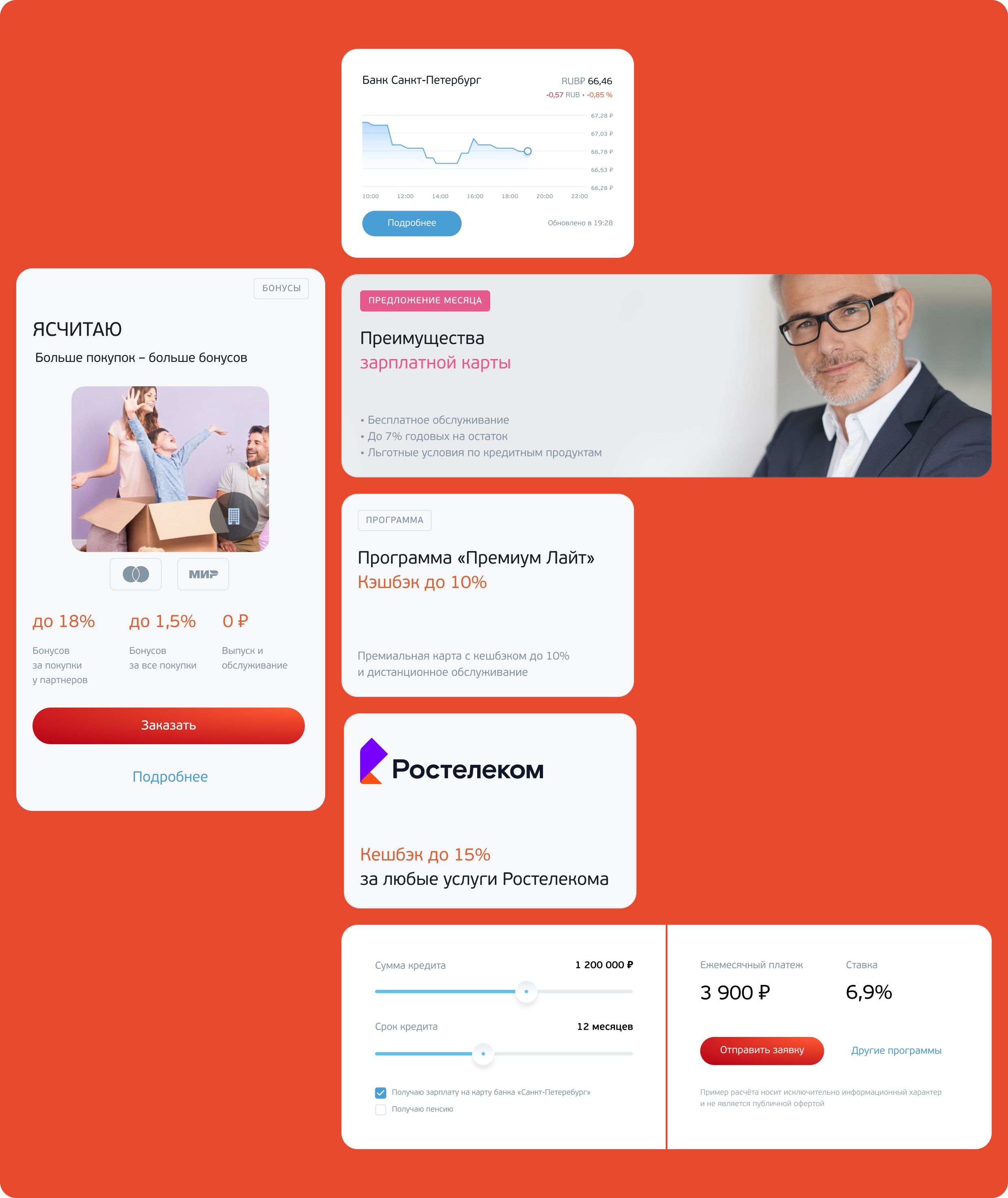
Bricks we use to build website pages
A stylized design of website sections
Some sections of the site are purposely different from the main page, but at the same time, they are made in the bank’s conceptual design and look consistent.
There are some examples of how the design vocabulary has adapted to the sections «Private Banking» and «Bright» below.
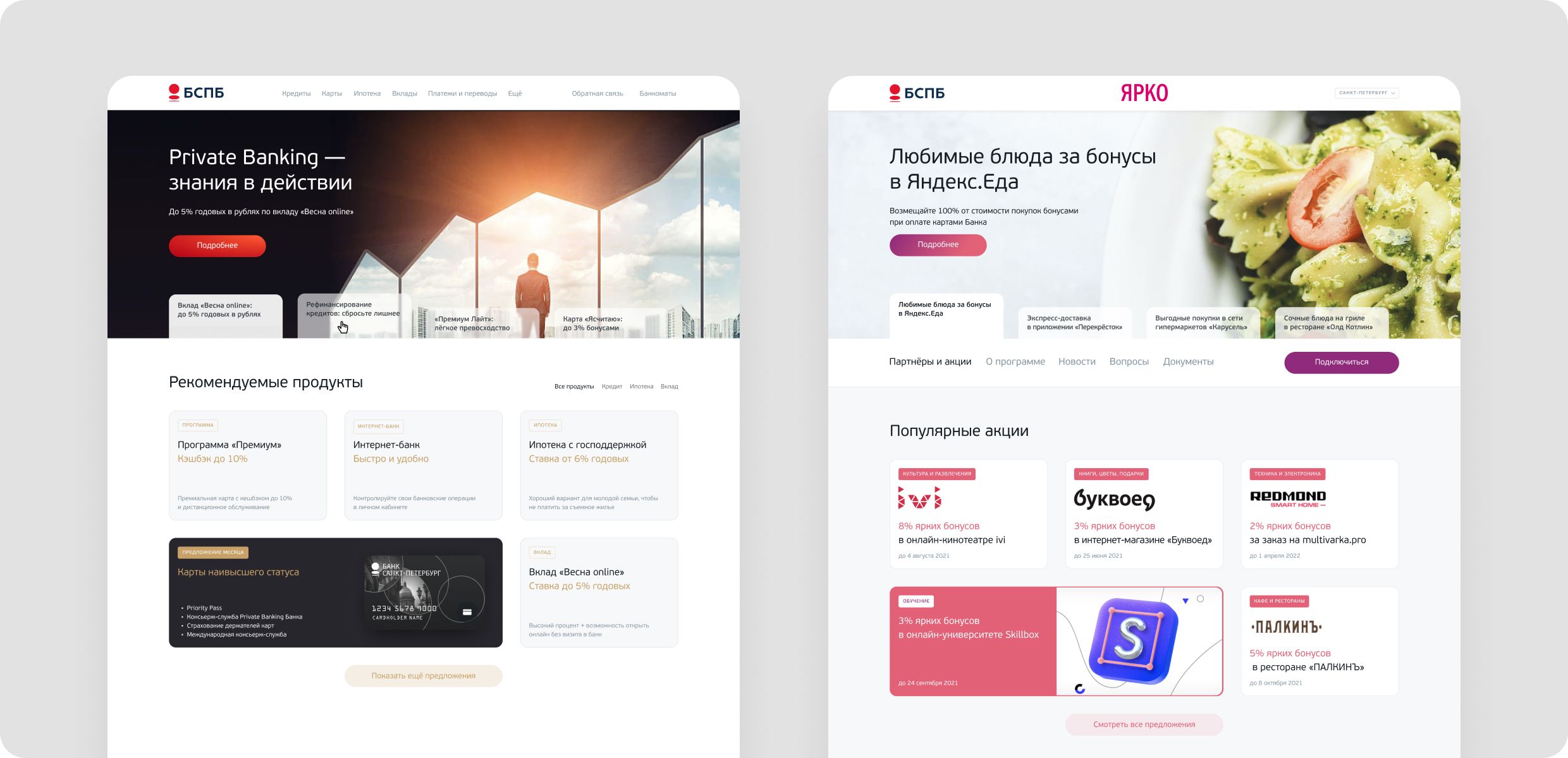
With a subtle movement of the code, the main page turns into a thematic section with the preservation of the visual pattern.
Development
We have chosen a tech stack that has helped to solve the task
React
Chakra UI — it has been chosen because of the speed, but we often joke that it has happened because of its name.
Strapi
A single language and easy customization
Node.js
Fast, widespread, and easy framework
Environment
We worked in such environments as local Env, test Env, pre-production Env, and production Env. The customer had already used Kubernetes, a deployment and maintenance system.
We deployed a test stand on Kubernetes to unify the process of deploying apps to servers and eliminate variations in the three environments:
go for internal testing to MobileUp
go to the bank for testing
go into production
Testing took place in two stages: our approval and tests on the side of the bank.
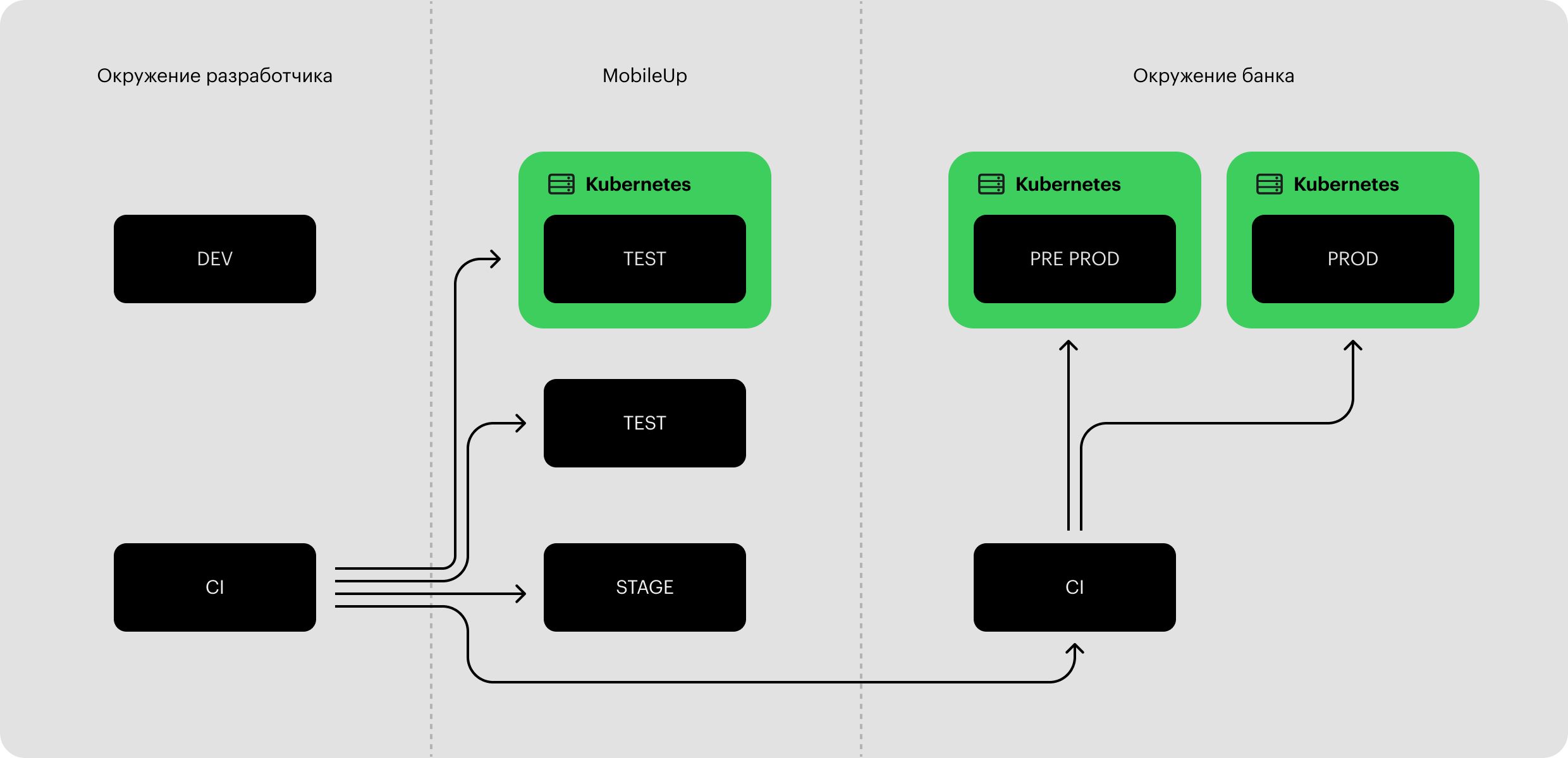
There was a simpler scheme, but our CTO insisted on authenticity.
Constructor and admin panel
When developing the constructor, MobileUp started by creating custom components. We quickly understood that this is not the best solution regarding flexibility.
We run a migration process from components to Strapi data types. This solution was chosen for convenience. On the one hand, this is a ready-made CMS, on the other hand, it can be quickly customized and flexible in layout.
The previous website had two admin panels for the web and mobile versions. We decided to use a boxed solution and made one admin panel to rule them all on the new one.
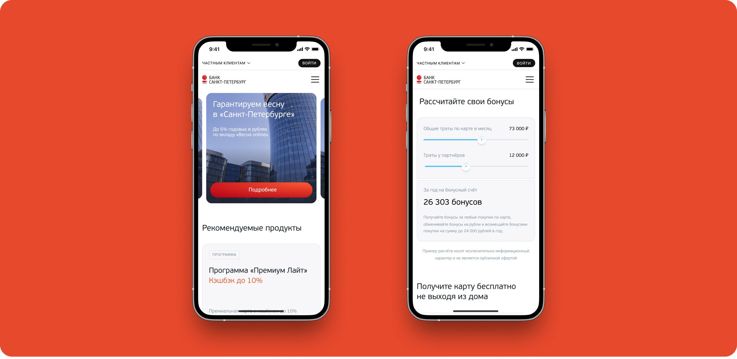
The site is so well optimized that it fits in your pocket.
Progress
We have reached the goal to make the site more dynamic and modern. The main task of the site updating was to reduce the time for creating new pages so that they remain in the design vocabulary of the bank.
Now you can refresh pages much faster thanks to our work. We are going to continue to work on the website development and its maintenance.
Заголовок

Despite on our extensive experience in the field, such large-scale projects are still thrilling. Then the day of release comes and you can’t believe that you came all this way.
Team
MobileUp project team
- Analyst
Tim Mostivenko
- UX/UI designers
Sasha Yudin, Anya Matveeva, Tyoma Tyutin, Emilia Bikmetova, Vanya Andreev
- CTO
Evgenii Valeev
- Developers
Yuri Voitekhovsky, Andrey Kudelko, Vova Ruban, Dima Komarov, Danya Grushkin, Pasha Fomin, Sasha Churkin
- QA engineers
Maxim Sharov, Zhenya Lozovskaya, Dasha Kurkina
- Business partner
Nayki Eremenko
- Partner relationship specialist
Ira Kazban
- Content
Kirill Malyshev
- Project manager
Platon Kultin, Margo Virvich
Bank Saint Petersburg project team
- System analyst
Roman Burangulov
- Content manager
Lena Mel
- DevOps
Anatoliy Sintsov
- Architect
Ren Shehtel
- QA engineer
Eugene Chistyakov
- Head of Design
Ilya Baziyan
- Website project manager
Sofia Gural
- Project manager
Ilya Solohnenko
Liptsoft project team
- Lead UX/UI designer
Nastya Ovsyannikova
- Lead Web designer
Anna Okrainskaya
- Web designer
Yulia Hudyakova
Collaboration
contacts
0We are always glad to cooperate and work on new projects
Describe the task, and we will contact you soon. Or you can always text us on Telegram.


